Elnaz Saeedlou UX/UI Designer

Blue-theory live class
WebApp redesign
A UX Case Study
Platform Web app
Duration 10 Weeks
Course UX/UI Niaz Zia Design School
My Role User Research,Information Architecture,Sketching and Wireframing,Visual and Interaction Design,Prototyping (Lo/Hi-fi),Prototype Testing.
Tools Figma , Photoshop, Miro
Overview Orange theory is a 1 hour, full body workout, focused on training Endurance, Strength and/or Power. Intensity is based on user’s heart rate zones, making the workout effective for all fitness levels. when the coronavirus COVID-19 pandemic hit and at-home workouts suddenly became the norm, many who still wanted that group class experience turned to virtual wellness in the form of streaming live and pre-recorded classes. This web app redesign named Blue theory is a sister company for the Orange theory - to give users the opportunity to keep their workout routines and facilitate the booking online classes.

Bluetheory - Live design
These three designs showing the final concepts for Bluetheorie’s Live Class interface.The most important features are placed at the buttom and the rest is in Kabob Menue.

Problem Statement
The importance and benefit of living a healthy lifestyle has not stopped with the spread of
COVID-19, people were looking for a good alter way for their daily gym trips. Huge reduce of in person users during Pandemic was a main problem of the Orangetheory.
Orangetheory uses big equipment including treadmills bikes and striders as alternatives which made switching to online classes a challenge.
Goals
Improve the sign up and enrolling process.
has a better user experience for sign up processAdd online classes to website for users to do daily workout without Covid related stresses.
Redesign the sign up process to add functionality to improve the user experience.
Motivate more people to join the Orange theory online class.
Time Line

Design Process
User Research
For the research Phase and to know more about user needs and concerns we did Survey and Interview, Competitive Analysis and Persona. we gathered 74 surveys responses and we Interviewed with 5 people.
Insights
-
The users would like to get confirmation for booking and cancelling so that they know the action is happened.
-
The users would like to have a profile page so that their workout history can be saved.
-
The users would like to find class schedule and membership info on the first page so that they don't have to look for it in the whole website.
-
The users would like to see rating for trainers so that they can get classes with their favorite instructor.
-
Users want to see the instructional pre recorded movie as well.
-
They want to see the instructor and interact with him/her.
-
the body metabolism is showing with color code. seeing the color code is really important to them.

Competitive Analysis
We did competetive analisis between Orange theory and seven more Fitness businesses which where similar to orangetheory for what they offer to users. The goal was to assess the strength and weaknesses of all and analize both offensive and defensive strategic context to identify optunities and threats.

Define
In the define phase I Noted users frustrations and created Persona and user journey map
User Persona
In order to create Understanding and empathy with the end users we designed two Personas.It helped us to recognize different needs and expections of our end users which are people stocking ar home and missing thier daily gym trips


Costumer Journey Map

Insights
-
User are Concerned about Covid 19 and frustrated staying home not doing their daily workout
-
The users would like to find class schedule and membership info on the first page.
-
Users would like to have free trial Class.
-
Users would like to see their progress and color zone during workout.
-
Interacting with trainer during the online class is important to users.
-
Users would like to be able to adjust the environment and music during class.
-
Users would like to have an easy online booking class.
-
They prefer to see the class list and information before paying for membership.
-
Users would like to get summery of their workout.
Solutions
-
we offered live classes with their own trainer they were working out with before Pandemic.
-
Simple and Intuitive booking online classes for Users.
-
User can keep monitoring their Color zone at home using BT beat wrist band connecting to the class.
-
Classes are live and with the same trainer and classmates. user can push raise hand and interact live.
-
User has the feature to change the background and music to have the preferred environment.
-
user can easily get evaluated and book the online class.
-
summery of activity page is designed for users.
Ideation
Brain Storming
After understanding users needs and so of their points we started doing brainstorming to step beyond obvious solutions and bring together perspective and strength of the whole team together. Next step was preparing Affinity diagram which helped us find out the relationship between Concepts and Ideas. this way we organized opinions, Ideas which helped us to start designing the wire frames.

Online Class
Booking & Registration
Others
Affinity Diagram

Blue Theory User Flow


Design Phase
Sketches


Wireframing
After understanding users needs and so of thier points we started doing barinstorming to step beyond obvious solutions and bring together perspective and strength od the whole team together. Next step was preparing Affinity diagram which helped us find out the relationship between Concepts and Ideas. this way we organized oponions, Ideas which helped us to start designing the wire frames.
Progress
Class List
Home Page
Membership

Home Page
My Account
Trainers
Evaluation

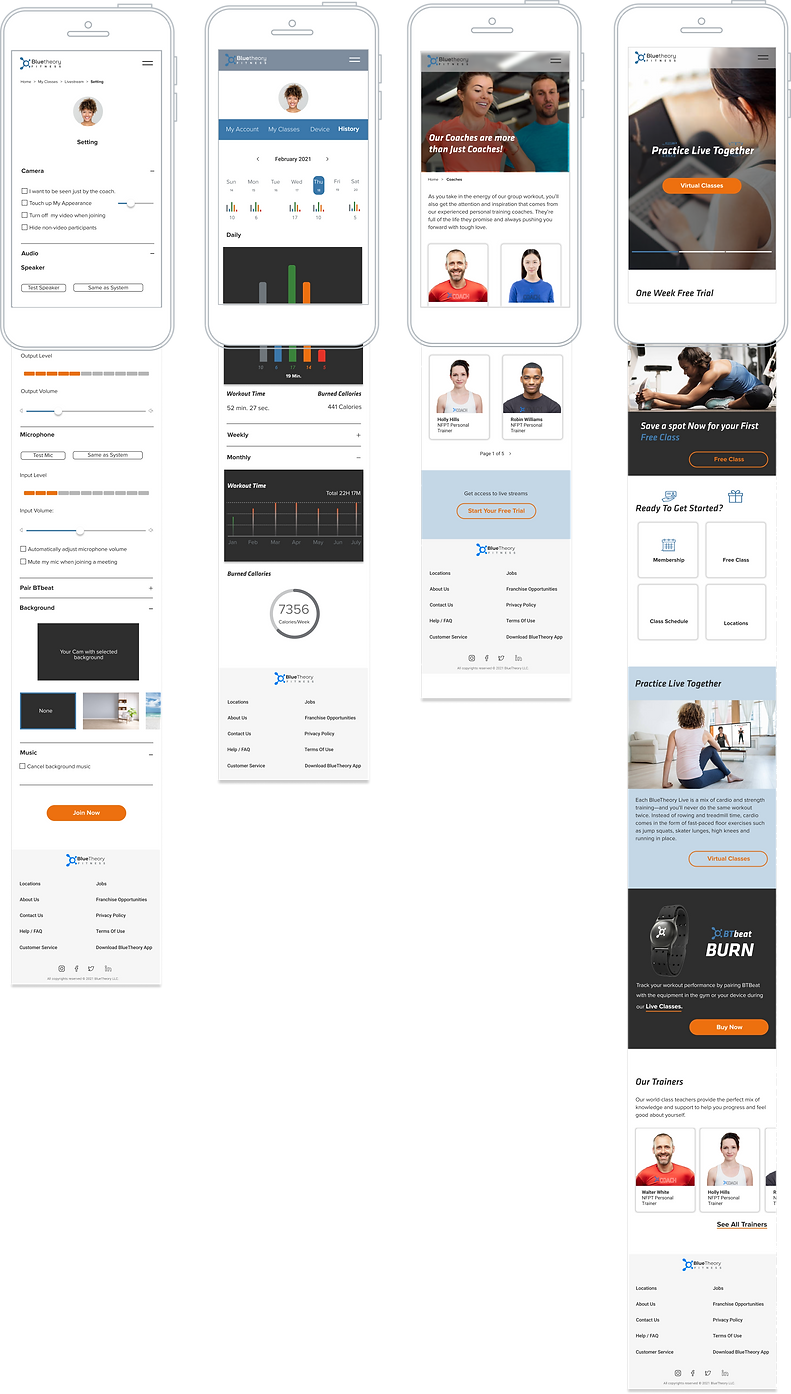
Final Design
Setting
History
Trainers
Homepage
08
Iterative Improvement for the Live Fitness Interface

Users Like to see the Class information on the workout page
Users like to see the instructor at all time
Workout Zone and Heart Rate is easy to see
User Can See all classmates
User Can Interact with the Coach Easily
All app’s Features and Buttons are accessible
Users Can See the Practice Guide
Users Like to see the Class
Inforamtion on the workout page
users like to see the instructor at all time
Workout Zone and Heart Rate is not Visible
User Can See all classmates
User Can See the recorded Guide
Clean and easy to Navigate Interface
Prioritized Features are not accessible
Class info is not easy to see
User Can See all
classmates
Users Can See the pre - practice Guide
users like to see the instructor at all time
Workout Zone and Heart Rate is easy to see
Clean and easy to Navigate Interface
Prioritized Features are accessible
User like to see the instructor at all time
User Can Interact with the Coach Easily
Workout Zone and Heart Rate is easy to see
All app’s Features and Buttons are accessible
Prototype


Color Scheme
01
02
03
04
#2E2E2E
05
#6F767B
06
#B7B7B7
07
#F7F7F7
08
#ED700F
#F4CFB1
#E63228
#3B78AB
Font Used
Klavika
Regular
Medium
Bold
Proxima-nova
Regular
Semibold
Bold
Usability Testing
We used the prototype to conduct a test on 4 users on our target demographic after finishing the prototype phase. According to the participants the web app was easy to use and they were Happy with the Design. positive and negative feedbacks from the users helped us uncover the opportunities to improve user experience.
-
Negative Feedbacks
-
Possitive Feedbacks
-
The sign up process is so long and frustrates the users.
-
users would love to see the whole class heart rate color to get motivated.
-
2 of users we did the test preferred to see more details about class before the get the membership.
-
one users told us the evaluation pages are inconsistent with the other pages.
-
3 of the users loved the idea of being evaluated during sign up.
-
they loved the idea the could see the pre recorded movie during the on line class.
-
all of the users tested loved the idea the can see the workout history.
-
2 of the users love the idea of being able to costumes the class with your preferred music.
My Learnings
-
I learned about diversity of opinions taught me the importance of user research.
-
I learned not to be bias for my Ideas and want and Needs of users are priorities.
-
Working with the team of 8 people, I learned the importance of collaboration, combining skillsets, seeing the problem from different points of view and it helps to not stock on your basis.
-
I learned and leveled up my skill of UX tools like Figma, Miro They played an important role in gathering and sorting Data.
What to improve
-
Online class interface needs improvement in details and features.
-
According to the usability testing, sign up process is long and may cause users not to want to continue. it needs to be redesigned.